Urbano: From Mass-Market to Premium
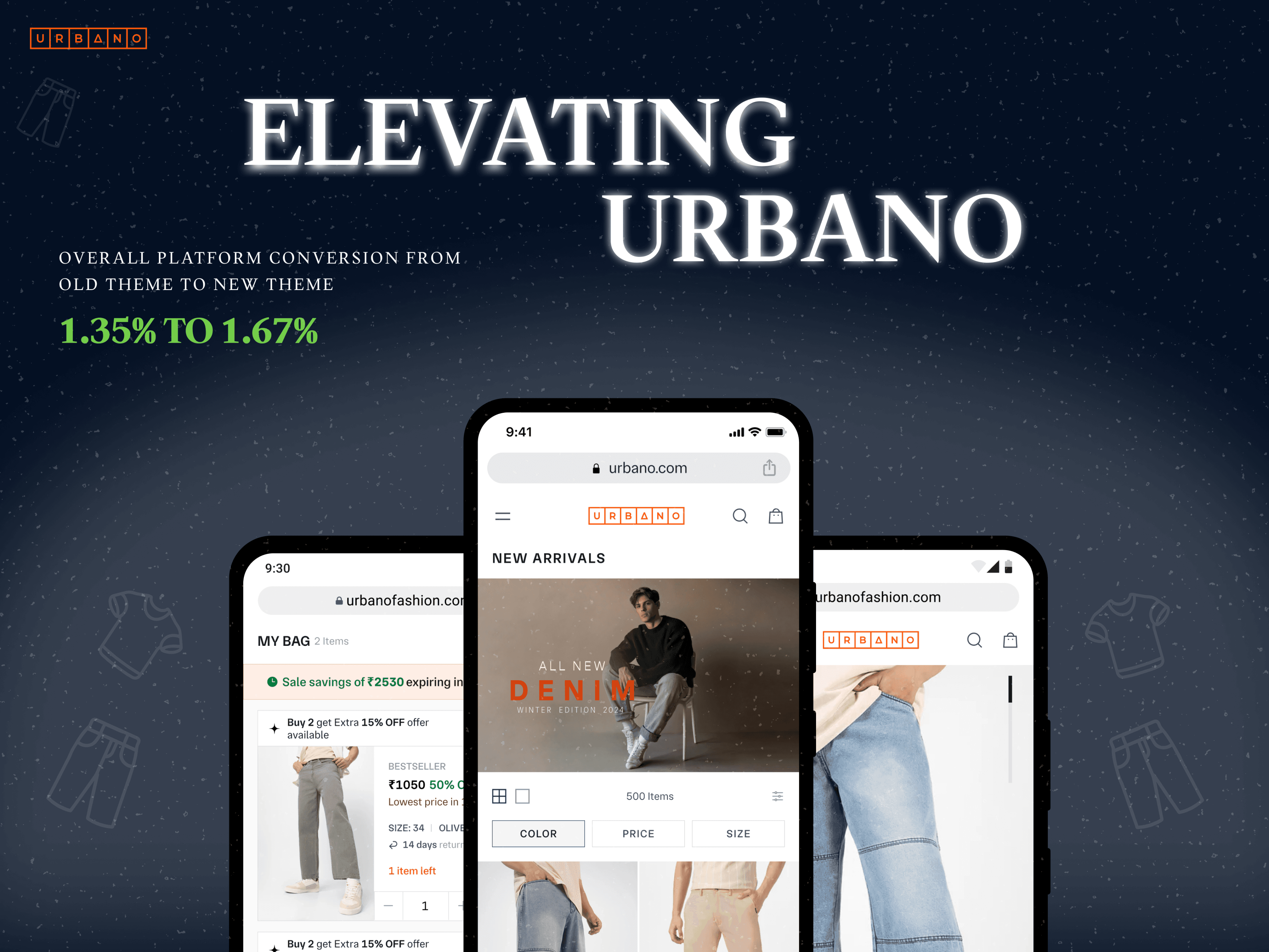
Revamped Urbano’s digital experience to shift its identity from mass-market to premium. Redesigned PLP, PDP, and Cart flows, introduced a design system, and improved usability — Conversion lift and stronger brand perception.
Business Goal
With Urbano’s growth came the need to reposition the brand from mass-market affordable denim, primarily targeting Tier 2/3 markets, to a premium, aspirational label. The business wanted a digital experience that not only reflected this identity shift but also streamlined shopping flows, improved navigation, and built stronger trust — ultimately driving higher conversions and long-term brand loyalty.
Solution & Design Process
To bridge the gap between mass-market perception and premium ambition, I redesigned Urbano’s core shopping journey — PLP, PDP, Cart — and built a cohesive design system. The process was iterative and data-driven, transforming the platform into a smoother, more premium experience that directly impacted conversions.
PLP: The Discovery Engine
Challenge
As we dug deeper, one thing became clear: the Product Listing Page (PLP) was a bottleneck. Though central to browsing, it felt outdated and overloaded, forcing users to jump between PLP and PDP pages for basic details. Instead of enabling discovery, the PLP often felt like a maze, not a guide.
Heavy, Cluttered Interface
Approach
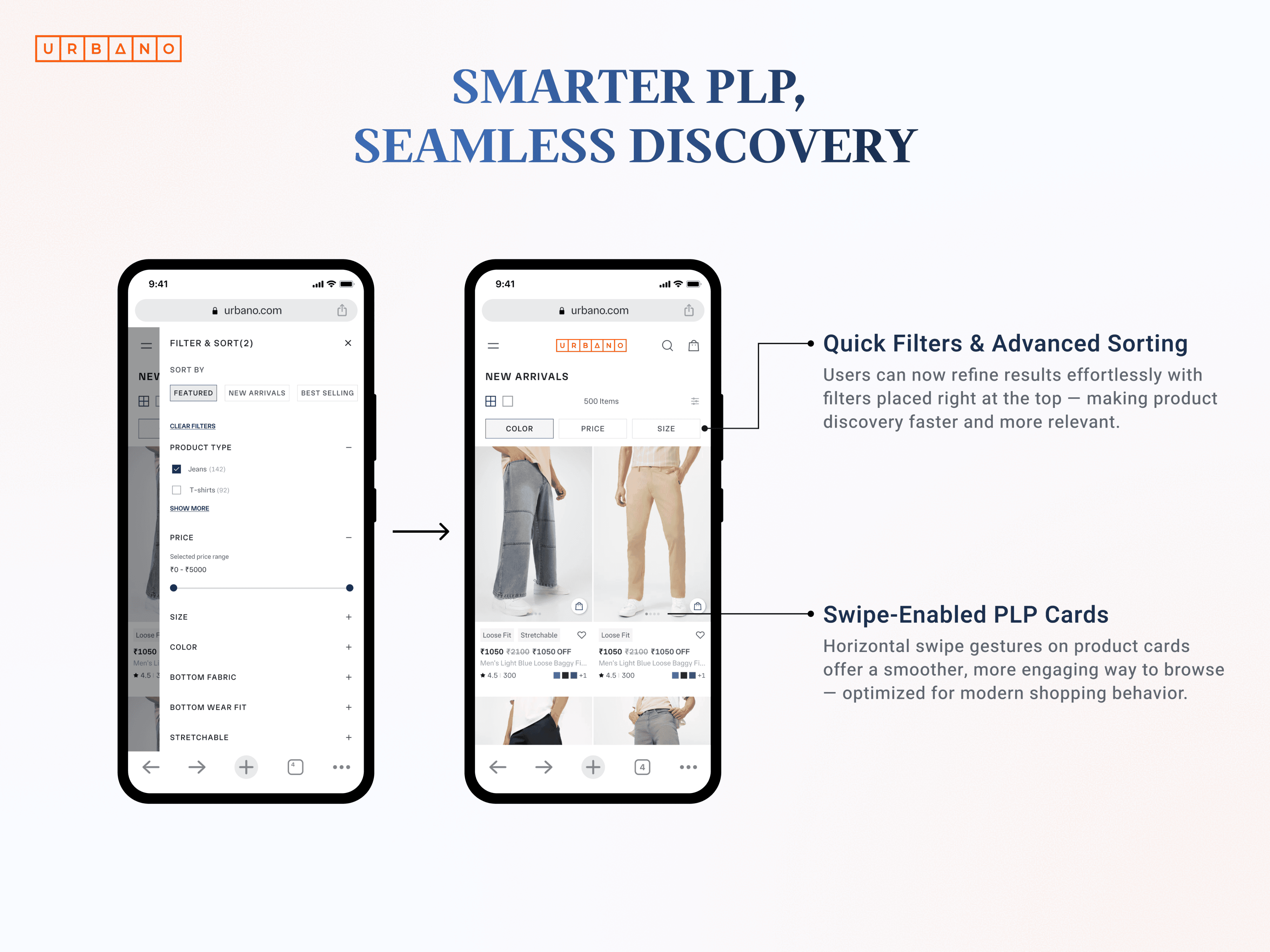
I reframed the PLP as a smart decision-making tool, designed to make browsing faster, filtering smarter, and choices more confident. The goal was to reduce cognitive load and turn the PLP into a seamless discovery experience.
Smart Information Hierarchy: Clear info upfront — no extra clicks
Enhanced Quick Actions: Size/color selection within grid view
Trust Indicators:
Social proof and availability status
Floating Action Button: Persistent cart access for smoother flow
"The redesigned PLP wasn’t just prettier — it was smarter. Users explored more products, made quicker choices, and checked out with greater confidence"
PDP: The Confidence Builder
Challenge
The Product Detail Page (PDP) was cluttered and unstructured. Key details were scattered, offers were hidden deep in the flow, and the lack of visual hierarchy made it hard for users to evaluate products confidently — leading to hesitation and drop-offs. This is where hesitation usually kicks in — users compare, doubt, or abandon. Our goal was simple: make the PDP feel clear, trustworthy, and conversion-driven.
Scattered information with no clear flow
Small product image size, reducing impact
No proper visual hierarchy for decision-making
Competing visuals and CTAs creating clutter
"If the PLP was about discovery, the PDP was about decision-making"
Approach
I redesigned the Product Detail Page (PDP) into a clear, guided purchase journey. A prominent image gallery led the flow, supported by vertical storytelling that surfaced key details at the right moment. This structure built trust, reduced hesitation, and kept users engaged through a smoother, more intuitive experience.
Trust Elements: Reviews, delivery info, and social proof surfaced upfront
Intuitive Flow: Single scroll with vertical storytelling structure
Fit & Stretch Labels: Clear product details reducing doubt
Challenges with PDP on m-Web
Designing Urbano’s PDP for mobile web surfaced a critical challenge. We had initially used a vertical scroll image container + bottom sheet. But during testing, we realized that on smaller devices the bottom sheet became inaccessible — leaving price and key product details hidden. This was a serious UX failure, especially on PDP where conversion intent is highest.
Final Solution
The issue sparked heated discussions between design, PMs, and developers. The dev team pointed out effort constraints, while PMs pushed for quick fixes. As designers, we emphasized the risk of broken UX and potential drop-offs.
After multiple iterations, we aligned on a solution:
● Fix image container at 70% of device height
● Surface details (price, fit & stretch tag, CTA) directly below, instead of a bottom sheet
● Sticky CTA ensured constant visibility of “Add to Cart”
One trade-off: product images cropped more on smaller devices. But since images rendered well on majority devices, we decided to proceed with this balanced compromise.
"👉 This experience taught us that designing for m-Web means designing for the lowest common denominator — and that collaboration (even through conflict) leads to practical, scalable solutions"
"This exercise reinforced a key insight: premium is not just how something looks, but how it feels in use. By solving real decision-making pain points, we didn’t just redesign the PDP— we elevated Urbano’s entire shopping flow to match the brand’s new ambition."
Cart Experience: The Final Nudge
Challenge
Once users added items to their bag, the cart experience became the decisive moment. Urbano’s previous cart was cluttered, lacked clarity on offers, and often distracted users with irrelevant recommendations. This created friction and unnecessary drop-offs.
Cluttered interface with too many elements
Lack of clarity on discounts and savings
Distracting product recommendations inside the cart
Approach
I redesigned the Cart with a clean, modern, and conversion-focused approach. The new experience highlighted savings, simplified the flow, and built confidence by making offers clear and contextual.
Smart Offers: Discounts shown next to products with one-tap apply
Prominent Savings: Value displayed right beside the checkout button
Simpler Flow: Removed recommendations to reduce distractions
Simpler Flow: Removed recommendations to reduce distractions
"This streamlined approach turned the cart into a confidence-builder — not a point of hesitation — ensuring users progressed smoothly from browsing to buying"
"What once felt like a tiring browsing loop now felt like a seamless, app-like experience"
Urbano: From Mass-Market to Premium
Revamped Urbano’s digital experience to shift its identity from mass-market to premium. Redesigned PLP, PDP, and Cart flows, introduced a design system, and improved usability — Conversion lift and stronger brand perception.
Overall Impact
+23.95% Overall Platform Conversion
+7.82%
Checkout Completion
About Urbano
Urbano is a homegrown denim brand that established itself in the mass-market with a bold, playful identity. As the brand matured, it set its sights on evolving into a more premium, aspirational label — calling for a complete revamp of its digital experience.
Why Reimagine?
The Context
Urbano’s original brand identity and early platform were playful, vibrant, and perfectly aligned with Tier 2/3 markets, helping the brand build strong early traction. However, as Urbano grew, its rising ambitions introduced new challenges and exposed clear gaps between perception and aspiration.
The Disconnect
Brand ambition: Premium positioning
Current perception: Mass-market, playful
User experience: Heavy navigation, fragmented shopping flow
Visual identity: Rounded fonts, bright colors—approachable but not aspirational
Business Goal
With Urbano’s growth came the need to reposition the brand from mass-market affordable denim, primarily targeting Tier 2/3 markets, to a premium, aspirational label. The business wanted a digital experience that not only reflected this identity shift but also streamlined shopping flows, improved navigation, and built stronger trust — ultimately driving higher conversions and long-term brand loyalty.
Solution & Design Process
To bridge the gap between mass-market perception and premium ambition, I redesigned Urbano’s core shopping journey — PLP, PDP, Cart — and built a cohesive design system. The process was iterative and data-driven, transforming the platform into a smoother, more premium experience that directly impacted conversions.
PLP: The Discovery Engine
Challenge
As we dug deeper, one thing became clear: the Product Listing Page (PLP) was a bottleneck. Though central to browsing, it felt outdated and overloaded, forcing users to jump between PLP and PDP pages for basic details. Instead of enabling discovery, the PLP often felt like a maze, not a guide.
Heavy, Cluttered Interface
Approach
I reframed the PLP as a smart decision-making tool, designed to make browsing faster, filtering smarter, and choices more confident. The goal was to reduce cognitive load and turn the PLP into a seamless discovery experience.
Smart Information Hierarchy: Clear info upfront — no extra clicks
Enhanced Quick Actions: Size/color selection within grid view
Trust Indicators:
Social proof and availability status
Floating Action Button: Persistent cart access for smoother flow
"The redesigned PLP wasn’t just prettier — it was smarter. Users explored more products, made quicker choices, and checked out with greater confidence"
PDP: The Confidence Builder
Challenge
The Product Detail Page (PDP) was cluttered and unstructured. Key details were scattered, offers were hidden deep in the flow, and the lack of visual hierarchy made it hard for users to evaluate products confidently — leading to hesitation and drop-offs. This is where hesitation usually kicks in — users compare, doubt, or abandon. Our goal was simple: make the PDP feel clear, trustworthy, and conversion-driven.
Scattered information with no clear flow
Small product image size, reducing impact
No proper visual hierarchy for decision-making
Competing visuals and CTAs creating clutter
"If the PLP was about discovery, the PDP was about decision-making"
Approach
I redesigned the Product Detail Page (PDP) into a clear, guided purchase journey. A prominent image gallery led the flow, supported by vertical storytelling that surfaced key details at the right moment. This structure built trust, reduced hesitation, and kept users engaged through a smoother, more intuitive experience.
Trust Elements: Reviews, delivery info, and social proof surfaced upfront
Intuitive Flow: Single scroll with vertical storytelling structure
Fit & Stretch Labels: Clear product details reducing doubt
Challenges with PDP on m-Web
Designing Urbano’s PDP for mobile web surfaced a critical challenge. We had initially used a vertical scroll image container + bottom sheet. But during testing, we realized that on smaller devices the bottom sheet became inaccessible — leaving price and key product details hidden. This was a serious UX failure, especially on PDP where conversion intent is highest.
Final Solution
The issue sparked heated discussions between design, PMs, and developers. The dev team pointed out effort constraints, while PMs pushed for quick fixes. As designers, we emphasized the risk of broken UX and potential drop-offs.
After multiple iterations, we aligned on a solution:
● Fix image container at 70% of device height
● Surface details (price, fit & stretch tag, CTA) directly below, instead of a bottom sheet
● Sticky CTA ensured constant visibility of “Add to Cart”
One trade-off: product images cropped more on smaller devices. But since images rendered well on majority devices, we decided to proceed with this balanced compromise.
"👉 This experience taught us that designing for m-Web means designing for the lowest common denominator — and that collaboration (even through conflict) leads to practical, scalable solutions"
"This exercise reinforced a key insight: premium is not just how something looks, but how it feels in use. By solving real decision-making pain points, we didn’t just redesign the PDP— we elevated Urbano’s entire shopping flow to match the brand’s new ambition."
Cart Experience: The Final Nudge
Challenge
Once users added items to their bag, the cart experience became the decisive moment. Urbano’s previous cart was cluttered, lacked clarity on offers, and often distracted users with irrelevant recommendations. This created friction and unnecessary drop-offs.
Cluttered interface with too many elements
Lack of clarity on discounts and savings
Distracting product recommendations inside the cart
Approach
I redesigned the Cart with a clean, modern, and conversion-focused approach. The new experience highlighted savings, simplified the flow, and built confidence by making offers clear and contextual.
Smart Offers: Discounts shown next to products with one-tap apply
Prominent Savings: Value displayed right beside the checkout button
Simpler Flow: Removed recommendations to reduce distractions
Simpler Flow: Removed recommendations to reduce distractions
"This streamlined approach turned the cart into a confidence-builder — not a point of hesitation — ensuring users progressed smoothly from browsing to buying"
"What once felt like a tiring browsing loop now felt like a seamless, app-like experience"
Key Learnings & Reflections
This project underscored several important lessons,
First, investing time in early user testing quickly exposed assumptions — what seemed clear to us was often confusing to real users. Iterating on wireframes with test users would have accelerated learning even more.
Second, collaborating across teams gave me exposure to different perspectives, which broadened my understanding of how design decisions affect not just users, but also product and business outcomes.
Thank you for spending your valuable time in reading my case study and I think you really enjoyed it.
Your feedback and suggestions are greatly appreciated for my growth.